 |
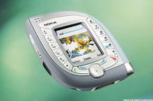
| ©Nokia/TheStreet illustration Nokia 7600 |
Attractive cell phones are easy to find.
Ever since Motorola's Razr and, later, the Apple iPhone, manufacturers have had to work hard on pleasing designs. Gorgeous, giant glass fronts framed in elegant black, sleek steel or shiny chrome, smartphones pack brains and beauty.
But not always. Before the mobile phone industry got all busy with design makeovers and tummy tucks, there were -- and still are -- some delightfully hideous phones that represented the other side of the beauty trend. The Street has gone back through the past decade to dig up some of the best examples of designs that make you wince and stare in disbelief. The clueless stylings, the flights of fancy into odd shapes, the obsession with square versus rounded -- it is a wonderfully colorful history.
Here are 13 of the ugliest phones ever in this century:
No. 1: Nokia 7600
Ladies and gentlemen, we have a winner. While Apple was changing the phone industry with a super-slim touchscreen iPhone in 2007, Nokia came out with this gem. (Shown above) It's not clear what inspired the small screen and the pig's ear shape, but it gets top honors in this contest. Any wonder why Apple is cleaning up in mobile, while Nokia is clearing out.
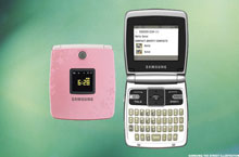 |
| ©Samsung/TheStreet illustration |
No. 2: Samsung Cleo
Ah yes, the "lady" phone. The Samsung Cleo really hit the mark with this one. Pink is bad enough, but does square really speak to the female phone buyer? What a cute, ah ... cigarette case? um ... makeup compact? Oh, look at that, it's a phone!
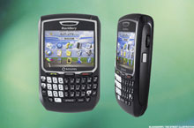 |
| ©BlackBerry/TheStreet illustration |
No. 3:Research In Motion BlackBerry 8700
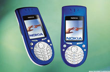 |
| ©Nokia/TheStreet illustration |
No. 4: Nokia3620
Not to be outdone by those pesky Swedes, Finnish phone giant Nokia totally turned the tables on the Sony Ericsson T61z and made the 3620 with an oval bottom and a square top. Take that Ericsson.
 |
| ©Sony Ericcson/TheStreet illustration |
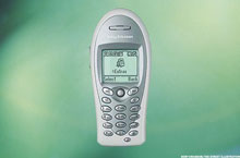
No. 5: Sony Ericsson t61z
It was a radical move by Sony Ericsson with the T61z phone. Do people want corners or curves? Let's give them both. Sony Ericsson made the T61z square on the bottom and oval on top. Brilliant. Who wouldn't like a phone shaped like a shoe-print?
 |
©Nextel/TheStreet illustration |
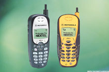
No. 6:MotorolaNextel i500
Police-tape yellow and shaped a lot like a firefighter's walkie-talkie, theMotorola Nextel i500 wasn't trying to be one of your pretty phones. It was aimed at first- responders of business. Tech crews and workers out in the field needed a rugged-looking phone on their belt; the i500 was the perfect accessory.
 |
| ©Motorola/TheStreet illustration |
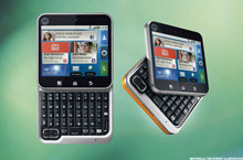
No. 7:Motorola Flipout
 |
| ©Microsoft/TheStreet illustration |
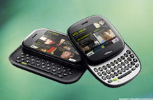
No. 8:Microsoft Kin
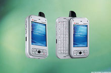 |
| ©HTC/TheStreet illustration |
No. 9: HTC Apache
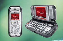 |
| ©LG/TheStreet illustration |
No. 10: LGVX9800
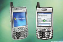 |
| ©Palm/TheStreet illustration |
No. 11: Palm Treo 700p
Palm, now a division of HP, arguably invented the smartphone. But the signs of Palm's eventual demise were evident with this later generation Treo. While its contemporaries were slimming their designs, Palm's Treo 700 arrived not only thicker but heavier than its Treo 600 predecessor.
 |
| ©LG/TheStreet illustration |
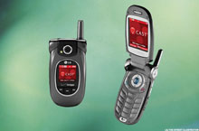
No. 12: LGVX8300
Like the Samsung hand grenade, the LG VX8300 was a lot of hardware all folded together.
 |
| ©Samsung/TheStreet illustration |
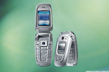
No. 13: Samsung SGH X800
Folding phones offer a compact and winning design.Samsung's SGH X800 got the folding part right, but it missed on the compact part. Open the phone was fine, but folded? It was like a fat little hand grenade.
Salam Ina..
ReplyDeleteNasib baik fon Naz tak termasuk dalam "ugliest phone" kt atas tu heheheeee..
Ina, datang umah amik award ye. Ni linknye:
http://ovenkecil.blogspot.com/2011/04/thanks-nieza-dear.html